import numpy as np
import pandas as pd#시각화는 있지만 자체적으로 show를 못해서 plt.show()로 출력하기
import matplotlib.pyplot as plt

#5개의 난수 생성
data = np.random.rand(5)
print(data)

# pandas 시리즈형 데이터로 변홖
s = pd.Series(data, index=['a','b','c','d','e'], name='series')
#index0,1,2,3,4 -> 'a','b','c','d','e'
print(s)

# pie 그래프 출력
s.plot(kind = 'pie' ,autopct = '%.2f',figsize = (10,10))
plt.show()

=>pandas_pie02.py
import matplotlib.pyplot as plt
import pandas as pd
import matplotlib
# '맑은 고딕'으로 설정
matplotlib.rcParams['font.family'] = 'Malgun Gothic'
fruit = ['사과', '바나나', '딸기', '오렌지', '포도']
result = [7, 6, 3, 2, 2]
df_fruit = pd.Series(result, index = fruit, name = '선택핚 학생수')
print(df_fruit)
df_fruit.plot.pie()
plt.show()

explode_value = (0.1, 0, 0, 0, 0) # pie 갂격설정
fruit_pie = df_fruit.plot.pie(figsize=(5, 5), autopct='%.1f%%',
startangle=90, counterclock = False,
explode=explode_value, shadow=True, table=True)
fruit_pie.set_ylabel("") # 불필요핚 y축 라벨 제거
fruit_pie.set_title("과일 선호도 조사 결과")
# 그래프를 이미지 파일로 저장. dpi는 200으로 설정
plt.savefig('saveFruit.png', dpi = 200)
plt.show()
seaborn 모듈
Titanic Datasetseaborn 라이브러리에서 제공되는 ‘titanic’ 데이터셋을 가져와서 다양핚그래프로 출력 해보자.
import seaborn as sns
titanic = sns.load_dataset(‘titanic’)
titanic 데이터셋에는 탑승객 891명의 정보가 담겨져 있다.
index : 891 ( 0 ~ 890 )
columns : 15 columns

=> seaborn_dataset.py
# 라이브러리 불러오기
import seaborn as sns
# titanic 데이터셋 가져오기
titanic = sns.load_dataset('titanic')
# titanic 데이터셋 살펴보기
print(titanic.head())
print('\n')
print(titanic.info())

회귀선이 있는 산점도
seaborn 모듈로 산점도를 그리기 위해서는 regplot() 함수를 이용핚다.
sns.regplot ( x = ‘age’ , # x축 변수
y = ‘fare’ , # y축 변수
data = titanic , # 데이터
ax = ax1 , # 1번째 그래프
fit_reg = True ) # 회귀선 표시
# seaborn 모듈로 산점도 그리기

# 라이브러리 불러오기
import matplotlib.pyplot as plt
import seaborn as sns

# Seaborn 제공 데이터셋 가져오기
titanic = sns.load_dataset('titanic')

# 스타일 테마 설정
# 스타일 테마 설정 (5가지: darkgrid, whitegrid, dark, white, ticks)
sns.set_style('darkgrid')

#그래프 만들기
# 서브 그래프 만들기
fig = plt.figure(figsize=(10,10)) #그래프 크기 설정
ax1 = fig.add_subplot(1,2,1) # 1행 2열 구조의 첫번째 그래프
ax2 = fig.add_subplot(1,2,2) # 1행 2열 구조의 두번째 그래프

#산점도 그래프 그리기
sns.regplot(x = 'age', #x축 변수
            y = 'fare', # y측 변수
            data = titanic, #데이터
            ax = ax1 , #첫번때 그래프
            fit_reg=True #회귀선 표시(기본값)
 )

# 산점도 그래프 그리기 - 선형회귀선 미표시(fit_reg=False)
sns.regplot(x='age', # x축 변수
        y='fare', # y축 변수
        data=titanic, # 데이터
        ax=ax2, # axe 객체 - 2번째 그래프
        fit_reg=False) # 회귀선 미표시
#가격이 싼데 많이 몰려있다.
plt.show()
범주형 데이터의 산점도
# seaborn 모듈로 산점도 그리기

# 라이브러리 불러오기
import matplotlib.pyplot as plt
import seaborn as sns

# Seaborn 제공 데이터셋 가져오기
titanic = sns.load_dataset('titanic')

# 스타일 테마 설정
# 스타일 테마 설정 (5가지: darkgrid, whitegrid, dark, white, ticks)
sns.set_style('darkgrid')

#그래프 만들기
# 서브 그래프 만들기
fig = plt.figure(figsize=(10,10)) #그래프 크기 설정
ax1 = fig.add_subplot(1,2,1) # 1행 2열 구조의 첫번째 그래프
ax2 = fig.add_subplot(1,2,2) # 1행 2열 구조의 두번째 그래프

#산점도 - 데이터 분산 미고려
#분포가 퍼지지 않다.
sns.stripplot(x ='class' , #x측 변수
              y = 'age' , #y측 변수
              data = titanic, #데이터
              ax = ax1 #1번째 그래프
              )

#산점도 - 데이터 분산 고려 - 데이터가 많을 경우 분산되여 있다.
#데이터가 많을 경우 분산해서 보여준다.
sns.swarmplot(x ='class' , #x측 변수
              y = 'age' , #y측 변수
              data = titanic, #데이터
              ax = ax2 #2번째 그래프
              )
#title 설정
ax1.set_title('stripplot()')
ax2.set_title('swarmplot()')

plt.show()
히스토그램과 커널 밀도 함수
#히스토그램과 커널 밀도 함수

# 라이브러리 불러오기
import matplotlib.pyplot as plt
import seaborn as sns

# Seaborn 제공 데이터셋 가져오기
titanic = sns.load_dataset('titanic')

# 스타일 테마 설정 (5가지: darkgrid, whitegrid, dark, white, ticks)
sns.set_style('darkgrid')

# 그래프 객체 생성 (figure에 3개의 서브 플롯을 생성)
fig = plt.figure(figsize=(15, 5)) # 그래프 크기 설정
ax1 = fig.add_subplot(1, 3, 1) # 1행 3열 - 1번째 그래프
ax2 = fig.add_subplot(1, 3, 2) # 1행 3열 - 2번째 그래프
ax3 = fig.add_subplot(1, 3, 3) # 1행 3열 - 3번째 그래프

#그래프 그리기 : 히스트그램 + 커널 밀드 그래프
sns.distplot(titanic['fare'], ax = ax1)

#그래프 그리기 : 커널 밀드 그래프
sns.distplot(titanic['fare'], hist=False, ax = ax2)

#그래프 그리기 : 히스트그램
sns.distplot(titanic['fare'], kde=False, ax = ax3)


# 차트 제목 표시
ax1.set_title('titanic fare - hist/ked') # 히스토그램 / 커널밀도함수
ax2.set_title('titanic fare - ked') # 커널밀도함수
ax3.set_title('titanic fare - hist') # 히스토그램

plt.show()
히트맵
import matplotlib.pyplot as plt
import seaborn as sns

# Seaborn 제공 데이터셋 가져오기
titanic = sns.load_dataset('titanic')

# 스타일 테마 설정 (5가지: darkgrid, whitegrid, dark, white, ticks)
sns.set_style('darkgrid')

# 피벖테이블로 범주형 변수를 각각 행, 열로 재구분하여 데이터프레임을 생성함
# aggfunc='size' 옵션은 데이터 값의 크기를 기준으로 집계핚다는 의미
# 등석에 따라 남자 여자 몇명인지 나오기
table = titanic.pivot_table(index = ['sex'],columns=['class'],aggfunc='size')

#히트맵 만들기
sns.heatmap(table,
            annot=True ,  # 승객수
            fmt = 'd' , #정수 형태로
            cmap='YlGnBu', # 색상 설정
            linewidths=0.5, #구분선 두깨
            cbar=False #컬러바 표시 여부 오른쪽에 생기는 것
            )
plt.show()
막대 그래프
# 라이브러리 불러오기
import matplotlib.pyplot as plt
import seaborn as sns
# Seaborn 제공 데이터셋 가져오기
titanic = sns.load_dataset('titanic')
# 스타일 테마 설정 (5가지: darkgrid, whitegrid, dark, white, ticks)
sns.set_style('whitegrid')
# 그래프 객체 생성 (figure에 3개의 서브 플롯을 생성)
fig = plt.figure(figsize=(15, 5)) # 그래프 크기 설정
ax1 = fig.add_subplot(1, 3, 1) # 1행 3열 - 1번째 그래프
ax2 = fig.add_subplot(1, 3, 2) # 1행 3열 - 2번째 그래프
ax3 = fig.add_subplot(1, 3, 3) # 1행 3열 - 3번째 그래프

#막대 그래프 그리기
sns.barplot(x = 'sex' , y = 'survived', data=titanic , ax = ax1)

# x축, y축에 변수 핛당하고, hue 옵션 추가하여 누적 출력순으로 출력
sns.barplot(x='sex', y='survived', hue='class', data=titanic, ax=ax2)

# x축, y축에 변수 핛당하고, dodge=False 옵션으로 1개의 막대그래프로 출력
sns.barplot(x='sex', y='survived', hue='class', dodge=False, data=titanic, ax=ax3)
# 차트 제목 표시
ax1.set_title('titanic survived - sex')
ax2.set_title('titanic survived - sex/class')
ax3.set_title('titanic survived - sex/class(stacked)')
plt.show()
빈도 막대그래프
# 라이브러리 불러오기
import matplotlib.pyplot as plt
import seaborn as sns
# Seaborn 제공 데이터셋 가져오기
titanic = sns.load_dataset('titanic')
# 스타일 테마 설정 (5가지: darkgrid, whitegrid, dark, white, ticks)
sns.set_style('whitegrid')
# 그래프 객체 생성 (figure에 3개의 서브 플롯을 생성)
fig = plt.figure(figsize=(15, 5)) # 그래프 크기 설정
ax1 = fig.add_subplot(1, 3, 1) # 1행 3열 - 1번째 그래프
ax2 = fig.add_subplot(1, 3, 2) # 1행 3열 - 2번째 그래프
ax3 = fig.add_subplot(1, 3, 3) # 1행 3열 - 3번째 그래프

#빈도 막대 그래프
sns.countplot(x = 'class' , palette='Set1', data=titanic, ax = ax1)

#빈도 막대 그래프 : hue ='who' who(man, woman, child)값으로 각각 빈도 막대 그래프
sns.countplot(x = 'class' , palette='Set2', hue ='who', data=titanic, ax = ax2)

#빈도 막대 그래프 : dodge= False한개의 막대그래프에 나타남
sns.countplot(x = 'class' , palette='Set2', hue ='who', dodge= False, data=titanic, ax = ax3)


# 차트 제목 표시
ax1.set_title('titanic class')
ax2.set_title('titanic class - who')
ax3.set_title('titanic class - who(stacked)')


plt.show()
박스플롯 / 바이올린 그래프
# 박스 플롯/ 바이올린 그래프

# 라이브러리 불러오기
import matplotlib.pyplot as plt
import seaborn as sns

# Seaborn 제공 데이터셋 가져오기
titanic = sns.load_dataset('titanic')

# 스타일 테마 설정 (5가지: darkgrid, whitegrid, dark, white, ticks)
sns.set_style('whitegrid')

# 그래프 객체 생성 (figure에 4개의 서브 플롯을 생성)
fig = plt.figure(figsize=(15, 10)) # 그래프 크기 설정
ax1 = fig.add_subplot(2, 2, 1) # 2행 2열 - 1번째 그래프
ax2 = fig.add_subplot(2, 2, 2) # 2행 2열 - 2번째 그래프
ax3 = fig.add_subplot(2, 2, 3) # 2행 2열 - 3번째 그래프
ax4 = fig.add_subplot(2, 2, 4) # 2행 2열 - 4번째 그래프

#1. 박스 그래프
sns.boxplot(x = 'alive', y = 'age', data=titanic, ax = ax1)

#2. 박스 그래프 : hue: sex sex(male, female)로 구분해서 출력
sns.boxplot(x = 'alive', y = 'age',hue='sex', data=titanic, ax = ax2)

#3. 바이올린 그래프
sns.violinplot(x = 'alive' ,y ='age', data=titanic, ax = ax3)

#4. 바이올린 그래프 hue: sex sex(male, female)로 구분해서 출력
sns.violinplot(x = 'alive' ,y ='age',hue = 'sex', data=titanic, ax = ax4)

plt.show()
조인트 그래프
# 조인트 그래프

# 라이브러리 불러오기
import matplotlib.pyplot as plt
import seaborn as sns

# Seaborn 제공 데이터셋 가져오기
titanic = sns.load_dataset('titanic')

# 스타일 테마 설정 (5가지: darkgrid, whitegrid, dark, white, ticks)
sns.set_style('whitegrid')

# 1. 조인 그래프 : 산점도 + 히스트그램
j1 = sns.jointplot(x = 'fare', y = 'age', data= titanic)

# 2. 조인 그래프 : 회귀선 : kind ='reg'
j2 = sns.jointplot(x = 'fare', y = 'age',kind ='reg',  data= titanic)


# 3. 조인 그래프 : kind ='hex'
j3 = sns.jointplot(x = 'fare', y = 'age',kind ='hex',  data= titanic)


# 4. 조인 그래프 : kind ='kde'
j4 = sns.jointplot(x = 'fare', y = 'age',kind ='kde',  data= titanic)

# 차트 제목 표시
j1.fig.suptitle('titanic fare - scatter', size=15)
j2.fig.suptitle('titanic fare - reg', size=15)
j3.fig.suptitle('titanic fare - hex', size=15)
j4.fig.suptitle('titanic fare - kde', size=15)

plt.show()
조건을 적용하여 화면을 그리드로 분할한 그래프
# 조건을 적용하여 화면을 그리드로 분핛핚 그래프

# 라이브러리 불러오기
import matplotlib.pyplot as plt
import seaborn as sns

# Seaborn 제공 데이터셋 가져오기
titanic = sns.load_dataset('titanic')

# 스타일 테마 설정 (5가지: darkgrid, whitegrid, dark, white, ticks)
sns.set_style('whitegrid')

# 조건에 따라 그리드  나누기 : who(man, woman, child) , survived (0 or 1)
g = sns.FacetGrid(data = titanic, col ='who', row='survived')

#그래프 그리기: 히스트그램
g = g.map(plt.hist, 'age')

plt.show()
데이터 분포 그래프
#데이터 분포 그래프

# 라이브러리 불러오기
import matplotlib.pyplot as plt
import seaborn as sns

# Seaborn 제공 데이터셋 가져오기
titanic = sns.load_dataset('titanic')

# 스타일 테마 설정 (5가지: darkgrid, whitegrid, dark, white, ticks)
sns.set_style('whitegrid')

# titanic 데이터셋 중에서 분석에 필욯난 데이터 선택하기
titanic_pair = titanic[['age','pclass' ,'fare']]

# 조건에 따라서 그리드로 누누가: 3행 3열 그리드로 출력
g = sns.pairplot(titanic_pair)

plt.show()
인공지능(AI, Artificial Intelligence)이란 무엇인가?
인공지능이란 사람과 유사한 지능을 가지도록인간의 학습능력, 추론능력, 지각능력, 자연어 이해능력 등을 컴퓨터 프로그램으로 실현하는 기술이다.
비젼: 이미지 비디오 인식 하는 것
기계학습은 인공지능의 한 분야로 기계 스스로 대량의 데이터로부터 지식이나 패턴을 찾아 학습하고 예측을 수행하는 것이다
강화학습은 게임 쪽에서 많이 한다.
Perceptron은 학습이 진행될수록 선형 분리(linear boundary)를 업데이트하면서 학습
학습 데이터에 너무 지나치게 맞추다 보면 일반화 성능이 떨어지는 모델을 얻게 되는 현상을 과적합(Overfitting)이라고 한다.
Under Fitting-> 학습률이 떨어진다.적정 수준의 학습을 하지 못하여 실제 성능이 떨어지는 경우
Normal Fitting (Generalized Fitting)적정 수준의 학습으로 실제 적정한 일반화 수준을 나타냄. 기계 학습이 지향하는 수준.
Over Fitting -> 학습 데이터가 너무 적을 떄도 일어난다. train에는 학습이 잘된다. 학습 데이터에 성능이 좋지만 실제 데이터에 관해 성능이 떨어짐. 특히 조심해야 함.
Overfitting을 피하는 다양한 방법 중 검증(Validation) 기법을 알아본다.
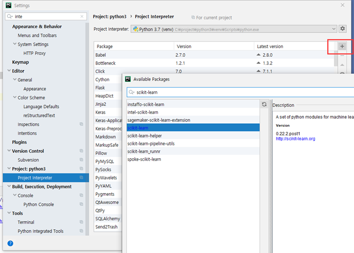
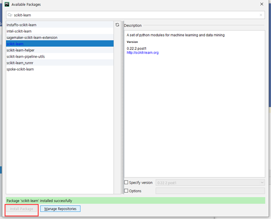
사이킷런 모듈 설치
1. python 에 설치
c:\> pip install scikit-learn
2. anaconda 에 설치
c:\> conda install scikit-learn
PyCharm에 scikit-learn 설치
단순선형 회귀 예제
y = ax + b 처럼 데이터를 만들어 회귀문제를 풀어 보자.
import numpy as np
import matplotlib.pyplot as plt
from sklearn import linear_model

# 학습 데이터 생성 난수를 가지고 만든다.
x = np.random.rand(100, 1)

x = x * 4 - 2 # -2 ~ 2
y = 3 * x - 2 # y = 3x - 2

# 모델 생성하기
model = linear_model.LinearRegression()#모듈을 직접 만드는 것이 아니라 linearRegression

# 모델 학습
model.fit(x,y)

# 학습을 하면서 규칙을 찾는다.
# x,y에 대해서 규칙을 찾는다.
#기울기라는 회귀계수 와 절별 (bias)
print("회귀계수(기울기)",model.coef_)
print("회귀계수(절편)",model.intercept_)

# 산점도 그래프 출력 (예측값과 실제 값 비교하기 위해서)
plt.scatter(x, y , marker='+')
plt.show()
y = ax + b 처럼 데이터를 만들어 회귀문제를 풀어 보자.
여기서는 y = 3x – 2에 정규분포 난수를 더했을때, 최소 제곱법으로 기울기와 절편을예측해 보자.
#단순 선형 회귀
import numpy as np
import matplotlib.pyplot as plt
from sklearn import linear_model

#학습 데이터 생성 3 0 ~ 1 사이의 난수 100개 생성
x = np.random.rand(100, 1)

x = x * 4 - 2 # -2 ~ 2
y = 3 * x - 2 # 고정된 값이 아니게 해야 한다.

#표준 정규분포(평균: 0 표준편차 : 1)의 난수를 추가 어떤 값이 나올지 모른다.
y += np.random.randn(100,1)

#모델 생성
model = linear_model.LinearRegression()

#모델 학습
model.fit(x,y) #x가 얼마일때 y가 얼마인지

# 예측값 출력
print(model.predict(x))
print()
print(y)

#회귀계쑤와 절편 출력
print("회귀계수:" , model.coef_)
print("절편:", model.intercept_)

#예측은 predict로 한다.

# 산점도 그래프 출력 (예측값과 실제 값 비교하기 위해서)
plt.scatter(x, y , marker="+") #실제값 데이터
#x가 얼마 일 때 y가 얼마인지 는 실제 데이터
plt.scatter(x, model.predict(x), marker='o')# 예측값 구하기
#x값이 얼마 일때 학습된 값 가지고 예측 한다.
plt.show()

#x가 학습데이터 x -> - 2~ 2 학습데이터 -> y = 3x -2 그대로 집어여면 y이 고정된다.
#y += np.random.randn(100,1) y 값에 누적을 생겨서 오차가 생긴다.
#y가 1일때 1으로 떨어지지 않는다.
# model.fit(x,y) 정확하게 떨어지지 않는 값이다.
#예측은 제공된 함수로 예측한다.
#난수이기 때문에 값이 다르다.